SHUEISHA Inc. All rights reserved.

Click here for Volume 1 → Discussing the Letterpress Vol.1
Click here for Volume 2 → Discussing the Letterpress Vol.2
Yoshinori Kuroyanagi
Born in Nagano in 1947, Yoshinori Kuroyanagi joined Tsutatomo Printing Co., Ltd. in March 1963. He is a printer who finishes printed materials that require advanced technology with expert skill. He has been with the company for 59 years. His hobbies include drinking, smoking, and sometimes fishing.
Masao Takaoka
Born in Tokyo in 1957, Mr. Takaoka joined his father's company, the Kazui Press in 1982, and has served as Representative Director since 1995. He is a Fellow of the Royal Society of Arts (RSA), a Tokyo Meister (outstanding engineer) certified by the Tokyo Metropolitan Government, a "Master of Techniques" certified by the Shinjuku Monozukuri Meister, and an advisor to Monotype.
Manga is the result of a long history of printing
Masashi Okamoto (SMAH) of Shueisha Manga-Art Heritage: Actually, today. Mr Takaoka brought in some movable type for us to look at.
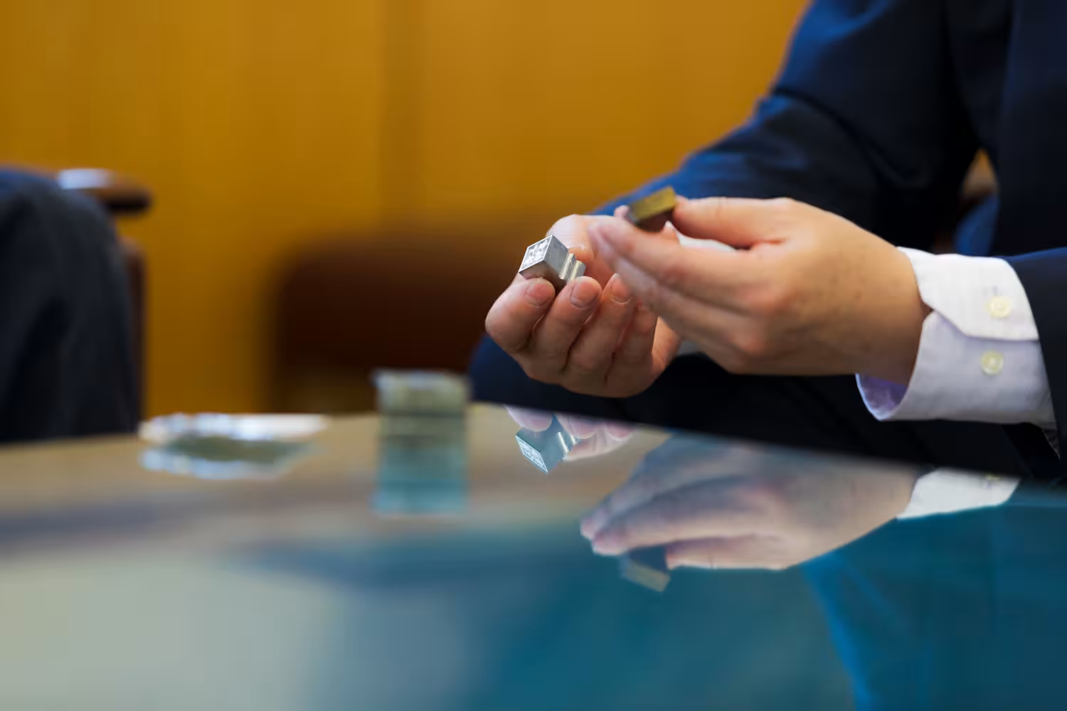
Masao Takaoka (Takaoka) of Kazui Kobou: I heard that in the past Tsutatomo Printing once gave away a matrix (the mold from which type is cast) and movable type to Mr. Muneo Suzuki of Nagoya Type Metal Refinery (Nagoya Jikin Seirensho). Kazui Kobou once had a matrix carved by Mr. Suzuki, and since we had it to hand, I brought it with me. In addition, this one here is type that my father received as a souvenir in France.
SMAH: May I look at it? This is where the lead is poured, right?
Takaoka: That's right. A matrix is placed in a mold, and a lead alloy is poured from the side to create this kind of type.
Takaoka: There is only one person who can make Japanese type now. Strictly speaking, there is another person who is older, but I heard that he is not working much now, so it's down to just this one person. But he can't make a matrix, either. Even if you order a piece of type, he will tell you that he can't make it because he doesn't have a matrix.
SMAH: Mr. Kuroyanagi, when you joined the company, did you ever cast type like this?
Yoshinori Kuroyanagi (Kuroyanagi) of Tsutatomo Printing: Yes, it was common practice.
Takaoka: It was called “in-house casting”. You have your own casting machine, and you make and use the typefaces needed for printing in-house. How many years ago were you doing this?
Kuroyanagi: I wonder how long ago it was… The person who was doing the casting has already quit.
Takaoka: How long ago did you start casting and using the letterpress?
Kuroyanagi: I'm not sure. When I first joined the company, there was a casting machine, and we used it up until the last minute before we were told not to use the letterpress anymore.
SMAH: When you say you were told not to use the letterpress anymore, is it because they were switching to offset printing?
Kuroyanagi: That's right.
Takaoka: There was a time when we used letterpress for color pamphlets and the such as what you just mentioned. However, when it became possible to make a block of text and offset printing, the letterpress was no longer necessary. The last remaining products were books such as novels, which are called page-mono. Once the use of phototypesetting became widespread and offset printing became possible, we decided to stop using letterpresses. This was because printing with a letterpress was inefficient and difficult.
SMAH: Mr. Takaoka, you also mentioned that you were strongly advised to stop using the letterpress and switch to offset printing. You said you were glad you didn't stop then. (Laughs)
Takaoka: That's correct. (Laughs)
Kuroyanagi: Type at the time was the starting point of printing. You would begin with the type selection process.
Takaoka: The work would go to a type selector, a typesetter, and then finally, a printer to print.
SMAH: Were there many craftsmen working at Tsutatomo Printing at the time?
Kuroyanagi: There were 300 people at the time. More than half of them were involved in typesetting. There were type selectors, typesetters, and casters. We had everything we needed.
Takaoka: If we didn't have the type, we would make it. We could just make a matrix and cast it.
SMAH: For manga text, movable type was replaced by phototypesetting, and nowadays, typesetting can be done on a computer. I think it is based on the accumulation the history of printing.
There is a theory that the origins of manga typesetting are based on the "Antigothic" style, in which kanji characters are rendered in Gothic type and hiragana text is rendered in Mincho type, mainly because of their high visibility while printing image and text together on a rotary press. Later, with the use of phototypesetting, text was printed out on photographic paper and then manually pasted onto the paper, and as a result variation in typefaces expanded rapidly.
SMAH: Without phototypesetting, it would be impossible to produce the kinds of text we see today, such as the shivering text used to evoke fear, or the bold, thick text used when a character is using a special move. We're now in the digital age of computer typesetting, but instead of tossing out past techniques and creating something new, what we have today is a cumulative result of the history of the craft.
Even if manga pictures are created digitally today, the basic typeface currently in use is still Antigothic. It is a very strange world, but I think it is a rich source of expression.
Can you tell us how the manga text appeared to you in the manga art you printed for this project?
Kuroyanagi: We've always worked with the kind of movable type that's cast. But manga isn't printed using movable type. Looking at it, I thought, "What kind of text is this?" That's what gives it the characteristic manga look and makes it interesting.
Takaoka: Regarding Antigothic typeface, I have heard a different explanation.
After the war, the number of company names written in katakana (the phonetic system used for foreign names, etc…) increased. But when you write the corporate status (the equivalent of Co., Ltd., etc… that are written in kanji (characters) next to it, the company name looks smaller and thinner in comparison. For example, if you write "Company Name Co., Ltd.", the "Co., Ltd." part ends up standing out more than the actual company name.
SMAH: Now that you mention it, that's certainly true.
Takaoka: With Mincho typeface, the katakana looks thin and small. Apparently, the Antigothic typeface was created because companies requested their name be written with thicker characters in order that the company name would stand out or at least not be diminished. That's why there are only hiragana and katakana in the Antigothic style. There are no Antigothic kanji.
SMAH: This conversation makes me think about how the names of manga characters are often written in katakana. I wouldn't be surprised if Antigothic typeface was chosen to make certain text stand out.
Takaoka: I think that is certainly a sufficient motive.
Artwork printed with the letterpress wins an international award
SMAH: Manga illustrations have often been sold as color printed works, but for our manga art, letterpress printing is used to create works of art from black-and-white illustrations.
I think the interesting aspect of manga expression is that it includes text in addition to images. The images are important, of course, but so is the text. When printed with a letterpress, the text stands out by sinking into the page, producing an impactful look.
Kuroyanagi: Yes, when I look at the project you've allowed me to be a part of, just glancing at the text evokes the feeling of manga. It's impactful in a way. This then allows me to try various things in my own way to see what could be possible, such as by adding more cylinder pressure and printing with greater strength. That way, the image doesn't show through the back, but the surface is given more texture.
SMAH: Thank you so much for your hard work. By the way, do you have a favorite manga? Do you read manga often?
Kuroyanagi: I think it was around the time my son was in elementary school when I bought and read all the volumes of Barefoot Gen (by Keiji Nakazawa).
SMAH: Barefoot Gen was a series published in Weekly Shonen Jump.
Takaoka: In my generation, we read Star of the Giants and Tomorrow's Joe.
SMAH: I see! It was interesting to hear all of your stories and insights today. Mr. Kuroyanagi showed me the actual work process, while Mr. Takaoka explained what Mr Kuroyanagi was doing.
Takaoka: What Mr. Kuroyanagi is doing is not acrobatics. It's a steady, step-by-step process of adjusting the amount of ink and adjusting the printing position. I think the accumulation of all these steps makes this project particularly challenging. As I observed him at work, I thought, "This is really tough work."
Not many people may be able to understand the difficulty of this process, but I can tell you from personal experience how hard it is to apply the resin plate or use such large amounts of ink.
SMAH: Every step of the process is a challenge, isn't it? Thank you so much.
Actually, thanks to your hard work, we have won the grand prize in the art category of the "GMUND AWARD," an international award from a German paper company founded in the 1800's. As part of the prize, we received a bottle of Dom Perignon, whose labels are made from paper created by GMUND. We had hoped to open it and make a toast here, but since everyone is driving today, I would like to ask Mr. Kuroyanagi to take it home with him.
Kuroyanagi: What? Me? I couldn't. You all should...
Takaoka: We insist. I know very well how hard you've been working. (Laughs)
SMAH: On that note, we look forward to continuing to work with you.
(Composition : Aya Okamura Photo & Movie by Toyokazu Fujita / HIORYES Inc.)
